This is the second part of the blog post I wrote to help facing the problems that could arise when styling complex, composite Views. Now it is time to go further, and see a working solution!
If you have not read the first part, this is a perfect time for doing that, because this post will take up where the first one left off.
Going further
It’s understandable and good practice to keep the structure of your View components described in XML layouts. However, as you will see by the end of this post, we will have to give it up to achieve our goal. Let’s see the options we have with XML layouts.
Still using XML, one can try to pass the properties of the child Views (in our case the Buttons) one by one, each one as a style attribute of the composite component. In our case, this would mean declaring the relevant attributes from the Button element two times under the declare-styleable tag of DoubleButton (once for the left button and once for the right). After that, we would have to process these attributes in the constructor of DoubleButton, as well as our custom View’s own attributes (left button text, right button text).
When choosing this approach, the built-in android attributes can be easily reused. For example, to use the android:text attribute, you just have to declare it as an attribute of the DoubleButton, but you must not specify its type:
<!-- Style attributes for the DoubleButton component. -->
<declare-styleable name="DoubleButton">
    <!-- Other attributes here... -->
    <!-- Reusing android:text attribute -->
    <attr name="android:text" />
</declare-styleable>
After that, you can retrieve the value of this attribute from the TypedArray this way:
TypedArray doubleButtonTypedArray =
        context.obtainStyledAttributes(attrs, R.styleable.DoubleButton, defStyleAttr, 0);
String text = doubleButtonTypedArray.getString(R.styleable.DoubleButton_android_text);
if (text != null) {
    Log.d("DoubleButton", "Text is " + text);
}
// Using other values from the typed array...
doubleButtonTypedArray.recycle();
As you see, this approach is definitely possible, but I do NOT recommend it! For some extents, it may be acceptable – if you want to offer only a few attributes of the Button class to alter -, but the more properties you’d like to make adjustable, the more mess your code will become – both the XML resources and the Java class.
The reason for this is that if you want to give full control, it’s not enough to support the properties of the concrete View class – which may already mean a lot of attributes on its own. You have to provide attributes to control the properties of the base class(es), and that can mean a very large number of attributes to create and process in your custom View’s constructor. As an example, let’s take a look at RadioButton, a Button that has a quite big ancestor hierarchy, with all of the base classes providing an additional set of properties that should be adjustable on the RadioButton.
Moving from XML to Java
Generally, you should design your code with keeping every layout in XML files, but as we know, for every rule there is an Exception – 😉 pun intended. Now, we just arrived at our exception, when the layout of the DoubleButton’s chidren will be moved to Java.
First, I would like to point out the expected result that we want to achieve. The purpose of these two blog posts is to show a solution for passing styles to a complex custom View – preferably in XML – that the View can use to adjust the style of its children. In our DoubleButton example, this should look something like this:
<!-- Style attributes for the DoubleButton component. -->
<declare-styleable name="DoubleButton">
    <!-- Style of the left button. -->
    <attr name="leftButtonStyle" format="reference" />
    <!-- Style of the right button. -->
    <attr name="rightButtonStyle" format="reference" />
    <!-- Left text and right text attributes omitted for brevity. -->
</declare-styleable>
As I mentioned before, the View class does have a three-argument constructor that can apply a style to the View when it is created. The third argument should not be a style resource (R.style.X) but an attribute (R.attr.X), so the attribute has to be “passed” to the XML layout somehow.
This can be easily done with this method in the TypedArray class.
The first step is to add the two new attributes to the declare-styleable element of the DoubleButton. This can be seen in the previous code snippet. After that, we can retrieve the passed attributes:
int leftButtonStyleAttribute = doubleButtonTypedArray.getResourceId(R.styleable.DoubleButton_leftButtonStyle, 0);
int rightButtonStyleAttribute = doubleButtonTypedArray.getResourceId(R.styleable.DoubleButton_rightButtonStyle, 0);
Now comes the tricky part. In the first part, I showed the layout that the DoubleButton inflates when it is being created. This layout is not needed any more, because we move the creation of the child Views inside the DoubleButton class:
LayoutParams childButtonParams = new LayoutParams(0, LayoutParams.WRAP_CONTENT);
childButtonParams.weight = 1.0f;

leftButton = new AppCompatButton(context, attrs, leftButtonStyleAttribute);
rightButton = new AppCompatButton(context, attrs, rightButtonStyleAttribute);

addView(leftButton, childButtonParams);
addView(rightButton, childButtonParams);
You may wonder why I use AppCompatButton in the code instead of the regular Button class. This is because the example project uses AppCompatActivity from the AppCompat support library, so every Button that I declare in XML is automatically replaced to AppCompatButton behind the scenes. For details, see this post and AppCompatViewInflater.
To see this new approach in action, I add another DoubleButton to the example screen. For the two DoubleButton, I have to declare a total of six theme attributes: two for the DoubleButtons, and four for the Buttons inside:
<!-- Theme attribute for the top DoubleButton on the example screen. -->
<attr name="topDoubleButtonStyle" format="reference" />
<!-- Theme attribute for the bottom DoubleButton on the example screen. -->
<attr name="bottomDoubleButtonStyle" format="reference" />
<!-- Theme attribute for the left button's style in the top DoubleButton. -->
<attr name="topLeftButtonStyle" format="reference" />
<!-- Theme attribute for the right button's style in the top DoubleButton. -->
<attr name="topRightButtonStyle" format="reference" />
<!-- Theme attribute for the left button's style in the bottom DoubleButton. -->
<attr name="bottomLeftButtonStyle" format="reference" />
<!-- Theme attribute for the right button's style in the bottom DoubleButton. -->
<attr name="bottomRightButtonStyle" format="reference" />
The DoubleButtons in the example screen’s layout (main_activity_layout.xml) look like this:
<com.juhasz.gyula.example.stylingcompositeviews.DoubleButton
    android:id="@+id/top_double_button"
    style="?topDoubleButtonStyle"
    android:layout_width="match_parent"
    android:layout_height="wrap_content" />

<com.juhasz.gyula.example.stylingcompositeviews.DoubleButton
    android:id="@+id/bottom_double_button"
    style="?bottomDoubleButtonStyle"
    android:layout_width="match_parent"
    android:layout_height="wrap_content" />
Here is the relevant part from the application theme that shows the styles that are assigned to these two DoubleButtons:
<item name="topDoubleButtonStyle">@style/DefaultTopDoubleButtonStyle</item>
<item name="bottomDoubleButtonStyle">@style/DefaultBottomDoubleButtonStyle</item>
And finally, here are the assigned styles:
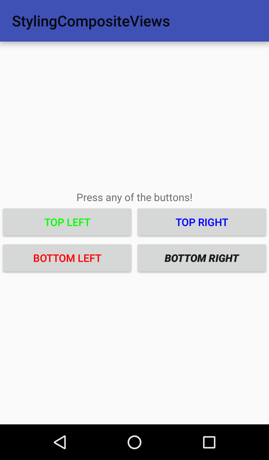
<style name="DefaultTopDoubleButtonStyle" parent="DefaultDoubleButtonStyle">
    <item name="leftButtonStyle">@attr/topLeftButtonStyle</item>
    <item name="rightButtonStyle">@attr/topRightButtonStyle</item>
    <item name="leftButtonText">TOP LEFT</item>
    <item name="rightButtonText">TOP RIGHT</item>
</style>

<style name="DefaultBottomDoubleButtonStyle" parent="DefaultDoubleButtonStyle">
    <item name="leftButtonStyle">@attr/bottomLeftButtonStyle</item>
    <item name="rightButtonStyle">@attr/bottomRightButtonStyle</item>
    <item name="leftButtonText">BOTTOM LEFT</item>
    <item name="rightButtonText">BOTTOM RIGHT</item>
</style>
As you can see in the highlighted lines, the styles are defined with the attributes that will point to them in the theme. I cannot emphasize the importance of this – if you pass styles, it will not work, but if you pass attributes, it will work like a charm. Sadly, Android Studio (and IntelliJ IDEA) marks these four lines with red, saying it cannot resolve the @attr reference. I don’t know the reason for this behavior – if anyone knows, please tell me in a comment -, since the attributes clearly exist, and it is perfectly legal to pass attribute resources to a View’s property.
We have now seen everything except the styles that are assigned to the Buttons inside the example DoubleButtons. The relevant part from theme.xml:
<item name="topLeftButtonStyle">@style/DefaultTopLeftButtonStyle</item>
<item name="topRightButtonStyle">@style/DefaultTopRightButtonStyle</item>
<item name="bottomLeftButtonStyle">@style/DefaultBottomLeftButtonStyle</item>
<item name="bottomRightButtonStyle">@style/DefaultBottomRightButtonStyle</item>
The styles:
<style name="DefaultTopLeftButtonStyle" parent="Widget.AppCompat.Button">
    <item name="android:textColor">#00ff00</item>
</style>

<style name="DefaultTopRightButtonStyle" parent="Widget.AppCompat.Button">
    <item name="android:textColor">#0000ff</item>
</style>

<style name="DefaultBottomLeftButtonStyle" parent="Widget.AppCompat.Button">
    <item name="android:textColor">#ff0000</item>
</style>

<style name="DefaultBottomRightButtonStyle" parent="Widget.AppCompat.Button">
    <item name="android:textStyle">bold|italic</item>
</style>
The result can be seen in the following screenshot:
The final solution
The example project that contains this solution can be seen here.
Pitfalls
So far, I have shown that it is possible to control the stlyes of the internal Views from the outside. However, you have to be careful, because little mistakes can ruin the appearance of your layouts.
Pitfall: using ?attribute form. The first mistake that is too easy to make here is using that form to reference the attributes. This comes natural, because usually we reference the attributes in the current theme by using this, and even the IDE leads you in this direction by marking the other solution as error. However, if you try this, you will see that the result will be awful, just like the next screenshot.
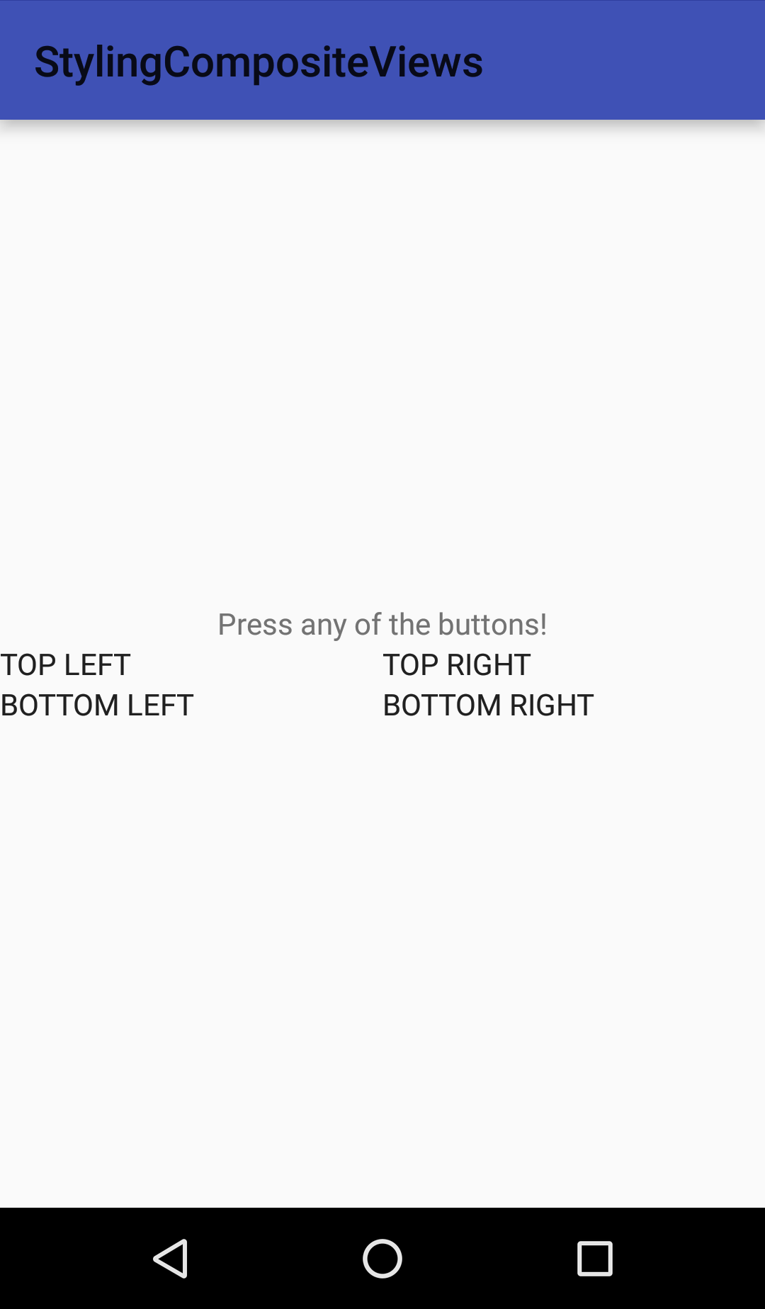
Wrong attribute references
Explanation: Using this form, Android will resolve the reference when you try to retrieve the attribute from the TypedArray. This means that the referenced style will be found and returned instead of the attribute. As I mentioned multiple times, passing the style as the third parameter to the constructor of the Button class will have no effect, so no style will be applied to the Button. Moreover, even its default style will be cancelled out because of this mistake. That’s what you can see on the screenshot.
Pitfall: forgetting parent styles. If you go back, you can see that all the styles for the left and right Buttons inherit from Widget.AppCompat.Button. If you forget to set the correct parent styles, you may end up with a layout that looks like the screenshot below. It is not as bad as the previous one, since at least the properties that you define in the Button styles are set, but the default properties of the Button element are not applied here either.
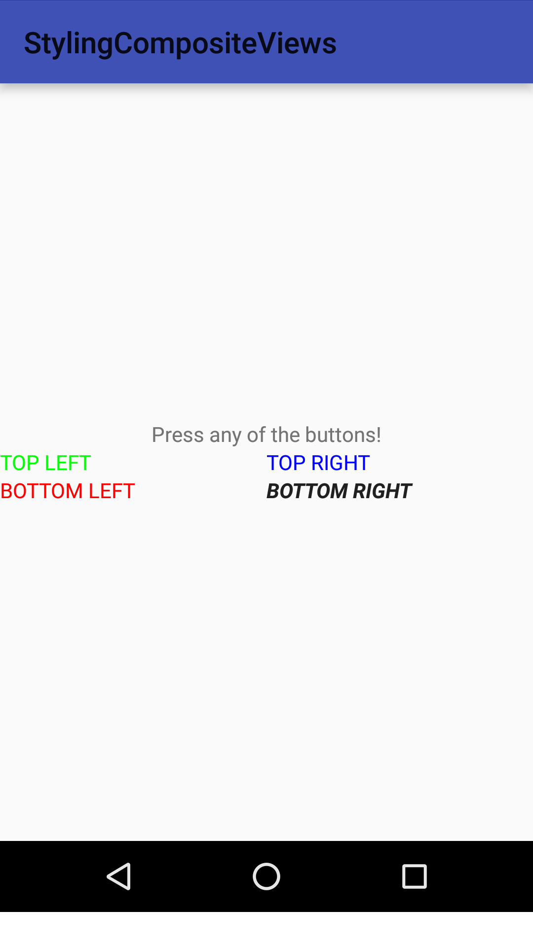
Missing style parents
Explanation: When inflating Views from XML layouts, Android always calls the two-argument constructor. It does not matter if you specify a style for the View in the XML, the result is the same. (You can check the code of LayoutInflater if you don’t believe me.)
Most Views have a default style attribute that is set to point to their default styles. Usually, the two-argument constructor of a View calls through the three-argument constructor, passing its default style attribute as the third parameter. You can see a lot of examples for this in the Android source code. The default style can be different in different Android versions, and it can be obviously changed in the theme of the application.
In our final solution, we pass our own style attribute to the constructor of the View, so its default style will not be applied any more. That’s why we have to set the parent of our style correctly if we do not want to lose the default properties of the View.
Conclusion
This method may not be ideal, but this is the closest I could get to in order to solve this particular problem. For built-in Views, it may not always be completely straightforward to find the default style to use as parent of your own styles, but it is not impossible either. In addition, when styling your custom Views inside a custom View, the default parent style is always in your hand. 🙂