Android provides two very useful features: styles and themes. Styles save you from repeating yourself in your XML layouts over and over again, while themes make it easy to adjust the look of your application without having to modify a lot of code.
However, despite being very useful, these features are not perfect, since nothing is perfect anyway. Maybe the most remarkable flaw is the inability to set a View’s style from code. I agree that this may not be a common use case, but there are times when this could be useful – for example:
- creating a dynamic, customizable UI framework
- controlling the UI theme from server side
- creating a composite View with children that should be styleable
There are some workarounds to overcome this, but all of them have their limits.
At least it is possible to create Views from code with the desired style by using the three-argument constructor. However, this is not as intuitive as it should be, since it only works if you provide a theme attribute – an attribute that points to the desired style in your application’s theme, in the form of R.attr.X -, and it will fail if you give the constructor a style resource (R.style.X). This is not too confusing nowadays, but in the ancient times the documentation was not so clear about this, and developers could easily find themselves scratching their heads trying to figure out why the style is not applied to the View.
Later, the Android team added the ability to use a style resource (instead of theme attribute) here, but there are two things to consider before using it. This constructor is only available on API 21 (Lollipop) and later, so you have to use it with care. In addition, if you check the documentation, it can clearly be seen that it’s confusing too. That complexity is caused by how obtaining a TypedArray works, and this is not expected to change in the foreseeable future, so the confusion and the limitations remain.
The point I am trying to make here is styling can be tricky at times, and it definitely is tricky if you go one level further and try to style Views inside Views. In this two-part blog post, I will explore the options for styling composite View elements. I will start with a simple example, and at the end of the second part, I will show you a possible solution to the problem.
Let’s start!
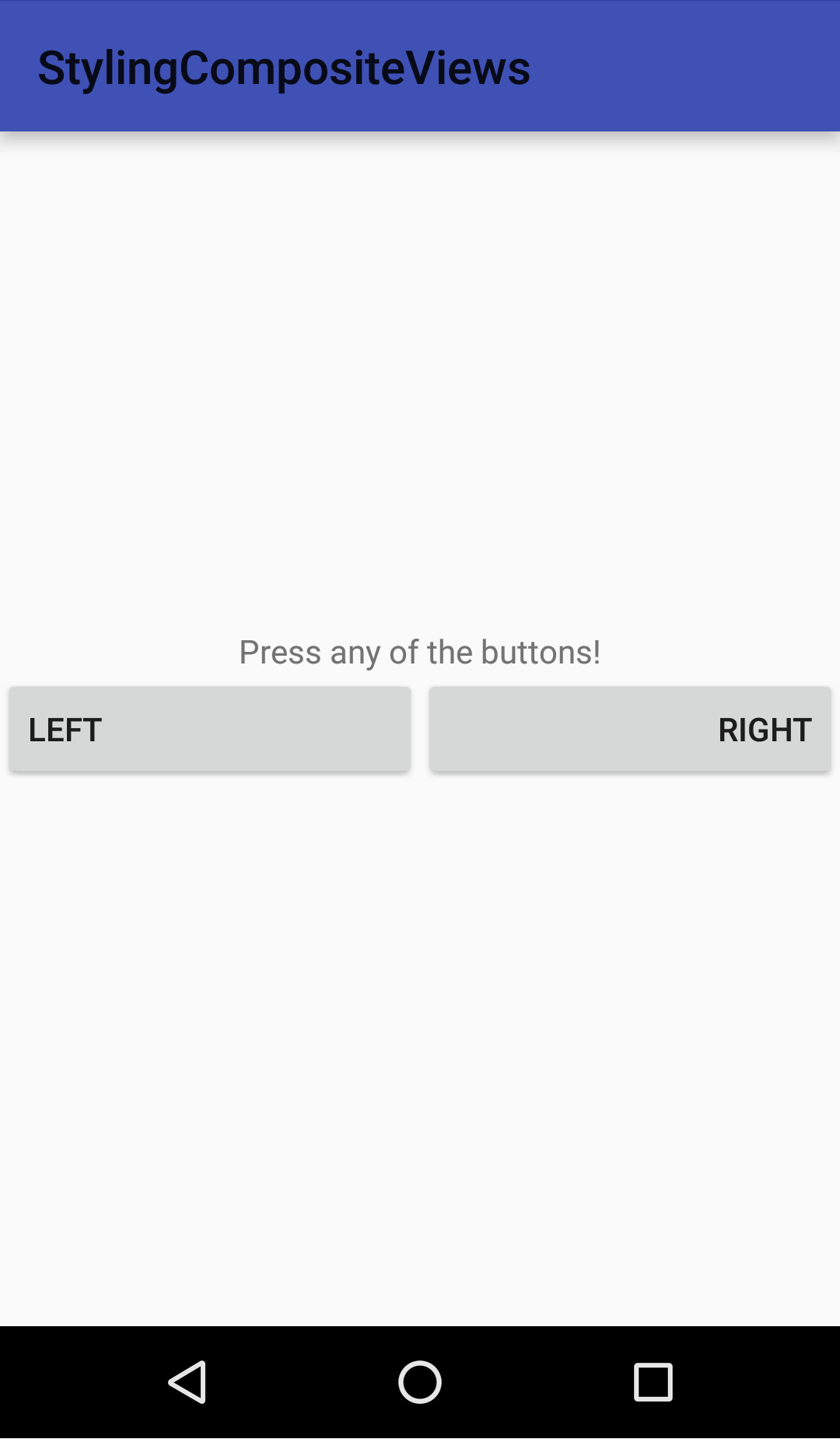
To show you how the styling is done, I’ll create a custom View that shows two equally wide Buttons next to each other. The name of the component will be DoubleButton. If you never tried this before, I recommend you to read the official guide, especially the first section.
Our custom View has two attributes that can be adjusted in XML. In addition, there is a theme attribute for controlling the default style of the View, but that is not important now. You can see the attribute declarations here:
<!-- Style attributes for the DoubleButton component. -->
<declare-styleable name="DoubleButton">
    <!-- Text of the left button. -->
    <attr name="leftButtonText" format="string" />
    <!-- Text of the right button. -->
    <attr name="rightButtonText" format="string" />
</declare-styleable>

<!-- Theme attribute for the default style for the DoubleButton component. -->
<attr name="doubleButtonStyle" format="reference" />
The component itself extends LinearLayout, and when created, inflates its children (the Buttons) from a layout XML file. The layout of the children looks like this:
<?xml version="1.0" encoding="utf-8"?>
<merge xmlns:android="http://schemas.android.com/apk/res/android"
    android:layout_width="match_parent"
    android:layout_height="match_parent">

    <Button
        android:id="@+id/left_button"
        android:layout_width="0dp"
        android:layout_height="wrap_content"
        android:layout_weight="1" />

    <Button
        android:id="@+id/right_button"
        android:layout_width="0dp"
        android:layout_height="wrap_content"
        android:layout_weight="1" />

</merge>
So far we do not have control over the appearance of the Buttons inside the DoubleButton from the outside. You can see the current state of the sample code here.
Our purpose is to be able to determine the style of the individual Buttons inside each of our components independently.
An initial idea
There is an easy way that can help us moving towards our goal, but it is not an ideal and final solution. We can define two more attributes that can control the styles of the Buttons. The attributes can be set in our application theme, so the user of our View can easily alter the styles of the Buttons. After the change, the attributes look like this:
<!-- Style attributes for the DoubleButton component. -->
<declare-styleable name="DoubleButton">
    <!-- Text of the left button. -->
    <attr name="leftButtonText" format="string" />
    <!-- Text of the right button. -->
    <attr name="rightButtonText" format="string" />
</declare-styleable>

<!-- Theme attribute for the default style for the DoubleButton component. -->
<attr name="doubleButtonStyle" format="reference" />

<!-- Theme attribute for controlling the style of the left button in the DoubleButton component. -->
<attr name="leftButtonStyle" format="reference" />
<!-- Theme attribute for controlling the style of the right button in the DoubleButton component. -->
<attr name="rightButtonStyle" format="reference" />
Notice that the newly added attributes are NOT the child of DoubleButton’s declare-styleable element. They are just two attributes that can be assigned to in the actual theme of the application. The layout of the child elements has been updated to use these attributes for styling the children:
<?xml version="1.0" encoding="utf-8"?>
<merge xmlns:android="http://schemas.android.com/apk/res/android"
    android:layout_width="match_parent"
    android:layout_height="match_parent">

    <Button
        android:id="@+id/left_button"
        style="?leftButtonStyle"
        android:layout_width="0dp"
        android:layout_height="wrap_content"
        android:layout_weight="1" />

    <Button
        android:id="@+id/right_button"
        style="?rightButtonStyle"
        android:layout_width="0dp"
        android:layout_height="wrap_content"
        android:layout_weight="1" />

</merge>
With this approach, we can successfully alter the appearance of the individual Buttons without having to modify the DoubleButton component. For example, we can set the gravity of the left Button to left, and the gravity of the right Button to right, as you can see in the following screenshot:
Example for using theme attributes
This solution may seem like a good idea, but there is a huge limitation: the child Buttons will have the exact same style in every DoubleButton. If you need to have multiple, different looking double buttons in your application, this is not the way.
The example code for the theme attribute approach can be seen here.
In the next part, we will go further to achieve our goal: styling the parts of the DoubleButtons independently from other DoubleButtons.
1 Pingback